
Auditions
For my next Art-o-mat series

I need to start another art project…Really? I don’t.
BUT I just got my check from Art-o-mat series 5 a couple of weeks ago which means that all of them are sold, and THAT means I should make more!
Actually, I don’t have time right now to make this series and yet, I ordered the blank blocks. I’m officially committed to make 50 little works of art, preferably easy works at that (because this is not a money making endeavor, not that it all has to be about making money…)
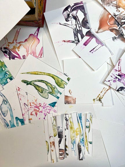
I was too tired to work on a project last night but I sat down anyway to “audition” the ghost prints that I created last weak. I’m not sure I’m completely excited by any of these performances.
I cut the prints into 2” x 3” rectangles to fit the blocks, then cut some of those into strips and squares and arranged them somewhat randomly:
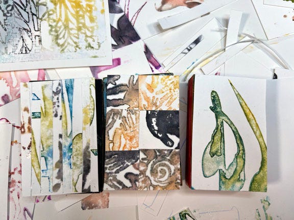
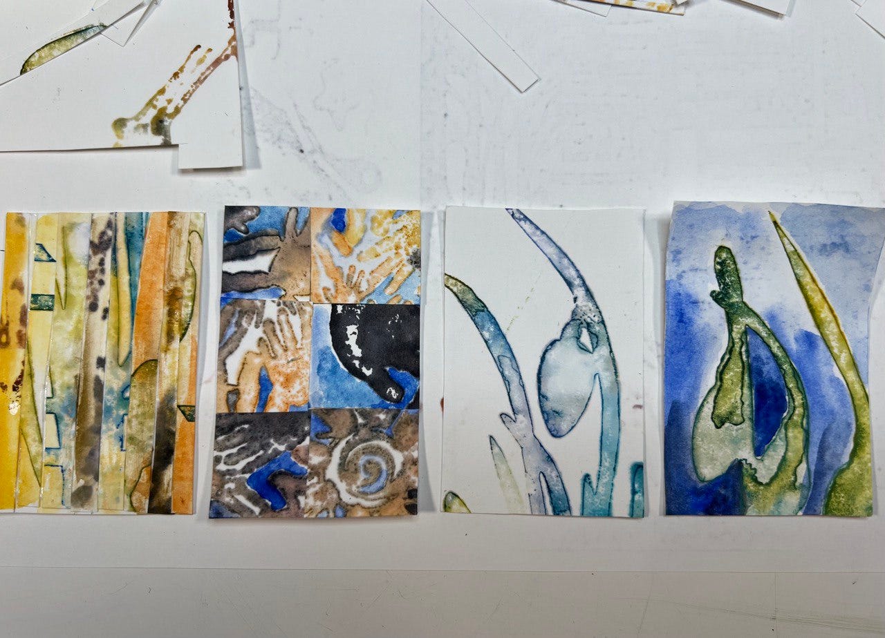
I added guache to three - washing over the entire print in the first one, painting out the white in some areas in the second, and painting all of the white in the fourth but leaving the alcohol ink untouched - as shown above. The third one I left alone: a simple white background with a subject (the subject matter will be cutouts from various prints, not necessarily that particular flower or flowers at all.)
What do you think?!
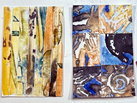
The two versions above are my favorites of the four. In the image on the left I like how the guache glaze of yellow and orange over the alcohol ink unified the random strips of paper and slightly modified the colors of the ink. The image on the right is interesting in terms of form and the play of values.
I’m still not sure if this is the direction for this series. I might do the squares concept but glaze the entire piece like I did on the left.
I’m going to keep thinking about it for a bit. And of course, I’m curious to see what you all think. Maybe I’ll use the poll result and/or comments to make my final decision!
Thanks for taking a Visual Coffee Break with me.
I like #1, something about the colors and design appeals to me ☺️ They're all great, though - whichever you decide will be a winner in my book!
#3 as the clean look appeals to me